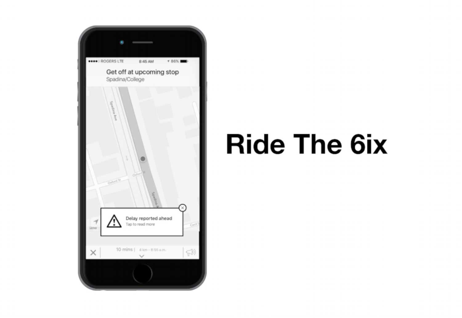
Ride The 6ix Mobile App
An iPhone app with community-based TTC traffic and delay reporting that will aid TTC commuters to work around the delays and make their commute an enjoyable one.
Overview
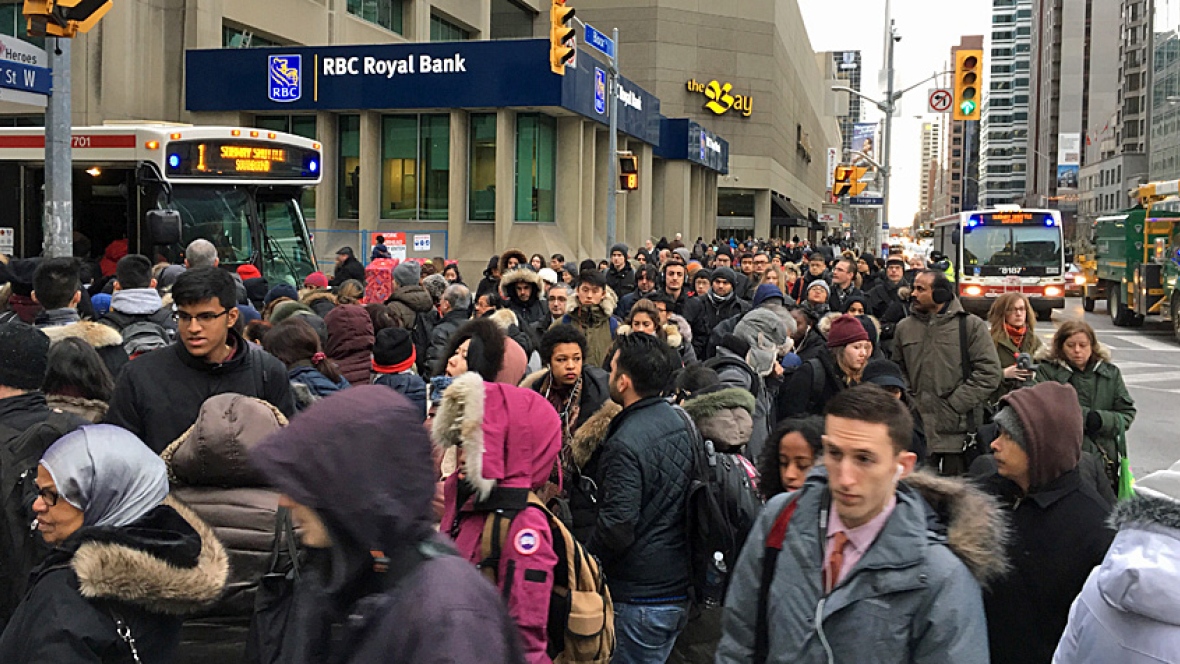
The metropolitan city of Toronto, at is rapid growth rate, has a multitude of problems that make it an unenjoyable city to some, compared to its American counterparts. One of the major problems that exist to this date is the public transportation system (TTC), in that it is unreliable due to multiple delays throughout each day. Personally, I experience this day to day whenever I travel to and from work. There would be signal problems in the subway at times, street cars breaking down, inconsistent arrival times of street cars and buses or arriving in 3s at a time. Sometimes the subways would simply shut down due to power failures and we are forced to use shuttle buses as seen here:

Transit massacre due to shutdown of subways.
In order to solve this problem, I designed a mobile app entitled Ride The 6ix. It is an iPhone app with community-based TTC traffic and delay reporting that will aid TTC commuters to work around the delays and make their commute an enjoyable one. To this date, due to the WiFi infrastructure within the TTC subways, this app would only work for WIND Mobile customers who are traveling via subway within the downtown core. Nevertheless, it works magnificently on surface routes such as street cars and buses.

Research
In order to move forward with the design process, I had to conduct some user research. Research, I believe, is a key aspect of UX design itself as both qualitative and quantitative data is needed to form the basis of design. The 3 user research methodologies I used are:
Interviews
Conducting user interviews and surveys was an extremely interesting and daunting process. As I’m not the most extroverted individual, talking to strangers was a bit difficult to do, hence I reached out to my social circle who I knew that are currently taking/have taken the TTC.
For face to face interviews, I started off with broad questions such as their thoughts on the public transit in the GTA area and then moved on to TTC specific questions. I geared the questions in the hopes of attaining information on their thoughts and feelings of using the TTC, their bad experiences, how often they check for updates in the TTC and how they go about doing it. The last question I asked them was about their thoughts on technology in this up and coming age.
I conducted 4 in person interview and one phone interview. The 4 interviewees were very relaxed after a long week of work, having a drink and some snacks while speaking to me. They were able to elaborate and pour out their thoughts and feelings for all the questions I asked them. Some of them were very analytical and psychological as well. The phone interviewee was also relaxed as well and answered all the questions with great thought and feelings.
Some excerpts from the interview:
“Tell me about a bad experience on the TTC.”
The street car going home (Queen 501) was all packed, I had to wait for 5 of them to pass by, finally got on one then it short turned onto Shaw, waited 15 mins, got another one then short turned again, waited another 15 mins. The subway going home is a nuisance as well, the station is always packed with people.
“How did you feel?”
I felt very frustrated and angry, had a murderous mindset…
“How do you normally check for what’s happening on the TTC?”
The TTC app, CP24 News, Twitter channel, Rocket Man app
“What do you think about technology, such as handheld devices in this up and coming age?”
No issues, I’m an avid user, I embrace it, but if not needed, then I won’t use it. I normally uses technology for personal enjoyment and I’m comfortable with technology and its upcoming changes.
Surveys
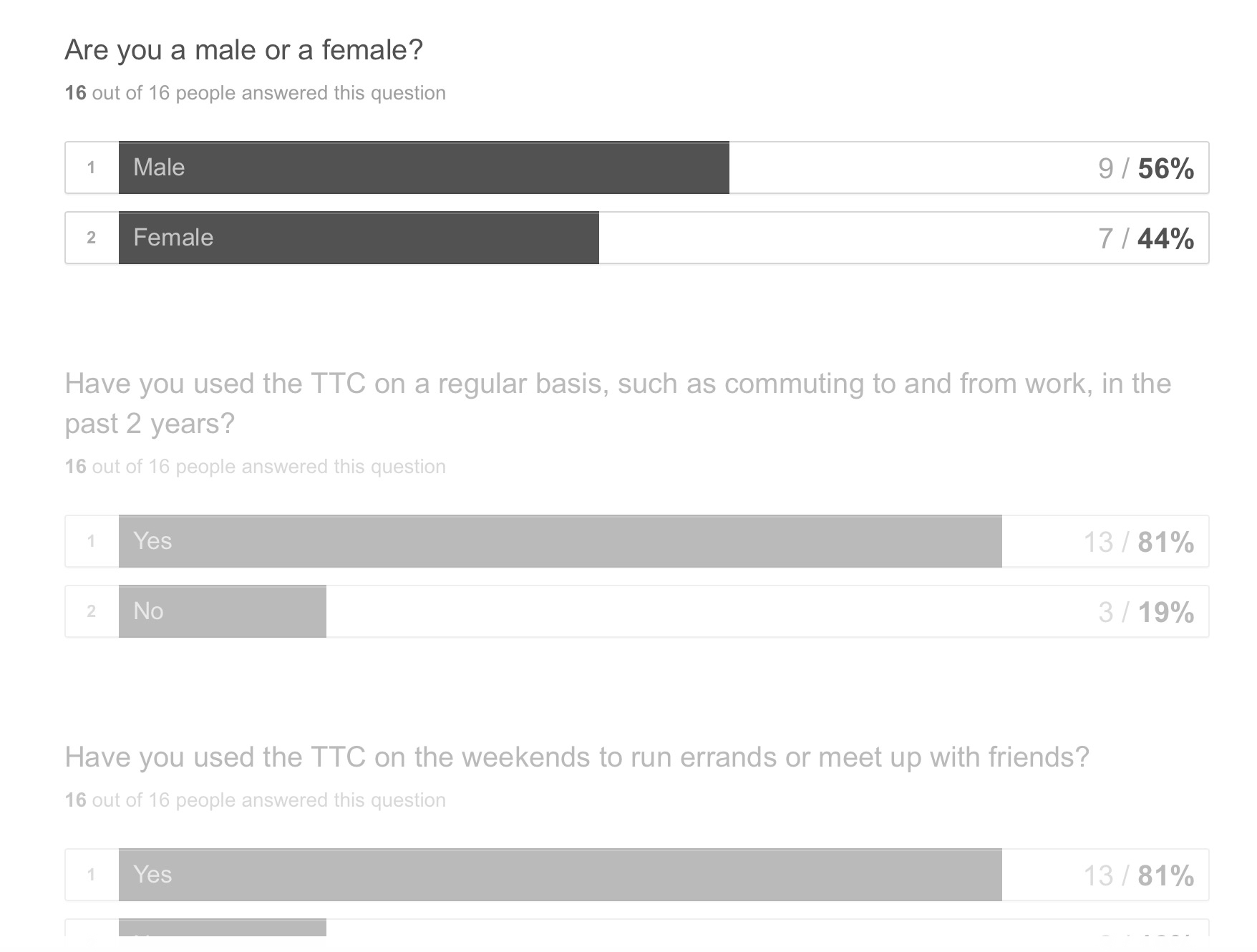
I used Typeform to create a survey and I gathered 16 responses, 9 male and 7 female and the average age is 34. For the survey questions, I created them specifically targeting the TTC, how commuters feel and what technology they use to check for updates. I even asked them for their comfort level with technology and which device they use the most. This, in turn, gives me a concrete idea as to the purpose of the app/website as well as the medium/platform it lies on.
A full detailed view of the survey questions and responses can be seen below:
Overall, some key findings were that they were neutral in terms of satisfactory of the TTC service. However, they do become very frustrated when it comes to delays and congestions on their transit route. In addition, in their opinion, the TTC needs to improve on better fleet management and scheduling, especially bunching (come in 3s at the same time). These commuters were also quite tech savvy and are also avid mobile phone users of all the devices existing today.
Comparative Analysis
In addition to the interviews and surveys, I had to perform a comparative analysis of some of the apps out there as I felt it was quite important to gather as much as insights as possible. To start off, I compared the features of 3 common transit apps that commuters use today: Rocket Man, Swiftly and Transit.
Click to enlarge
As you can see all of them are able to tell you the ETA of the bus/streetcar/subway of the route you’re interested in, a trip planner integration while Swiftly and Transit were able to venture out into different transportation method as well.
Some other apps I encountered and compared are as follows:
Click to enlarge
The major key component that’s missing is that they didn’t have real-time, community-based alerts similar to that of the infamous Waze app. Waze is a community-based navigation app that would provide the fastest, shortest or efficient route based on users sharing incidents, congestions on the road. I felt that something similar would definitely help TTC commuters to work around the delays, and try to get to their destination on time in harmony.
Persona
A persona definitely helps when it comes to the design phase of an app or website as a persona, itself, is an user you created based on your user research that will help test your app idea. Here is a persona I was able to put together from the results of the surveys and interviews that were undertaken:
Meet Peter Donaldson
Click to enlarge
Planning
The planning stage was very critical, in my opinion, as it forms the basis of your design.
Features
At first, based on the data I collected, I needed to define the main features of the app and categorize them in “Must Have”, “Nice To Have” and “Not Needed”. This was an extremely daunting process as there are tons of apps out there, which are competing with each other as well (Rocket Man, Swiftly, Transit) and they all seem very similar to each other. Hence it was quite difficult to come up with something very innovative. However, one thing I saw that was lacking with all of these apps was that it didn’t have the functionality to that of the infamous Waze app. Waze is a community-based navigation app that would provide the fastest, shortest or efficient route based on users sharing incidents, congestions on the road. I felt that something similar would definitely help TTC commuters to work around the delays, and try to get to their destination on time in harmony.
Here is a list of features I came up with based on the “Must Have”, “Nice to Have”, “Not Needed” model
Features List Version 1
Click to enlarge
User Flows
Coming up with the user flow was quite a challenge as there are so many scenarios that should be taken into consideration when designing for an enhanced transit app. These flows are very important in order to guide the user in finding an alternate route.
I just started to focus on a primary scenario where the user is already on a streetcar traveling to work and alerts regarding delays ahead start popping up on the phone. My first iteration of the user flow pretty much showcased all the steps on a high level where some steps denoted the features of a particular screen. However, after some feedback, I had to revise to break those steps even further and also had to integrate some annotation that the user’s phone has Location Services already activated. A legend had to be created as well, otherwise the whole flow didn’t quite make sense. I was really having a hard time as to figure out what the experience would be if the user decides not to take an alternate route; I simply redirected him/her to the home screen for now… I may have to rethink it through again or bounce off ideas from my peers.
Here is Version 1 of the user flow for the app:
Click to enlarge
Design
Low Fidelity Wireframes and Paper Prototypes
What can I say, the paper prototyping process was really an interesting one. I was able to implement all the sketches I created based on the user flow into POP and share it to almost the same users who completed the survey and interviews I held earlier. I ensured that they look at the app based on the following scenario:
You are on the streetcar traveling to work and an alert of a delay ahead pops up on your phone. Location services is turned on.
Out of this group, only 4 individuals responded unfortunately. The background of these 4 individuals were a mix of developers, logistic analyst and a TTC employee in the parts department.
They did provide interesting feedback and asked some interesting questions:
“Do you program a route first and while taking the streetcar on that route, does this prompt come up if there’s a delay or is itself predictive that will see that you’re on a certain route and be smart enough to warn of an upcoming delay? Reason is if you’re on a Queen streetcar it won’t just say there’s a delay on King street car or any other route because these routes don’t intersect anyway.”
“Does it give alternative routes or just one route alternative as shown in the map screenshot?”
“Where and how does the route delays originate on the map? From user feedback like in Waze or does TTC issues the route delay?”
“Does the app give the user the ability to report delays they encounter of their own on a specific route and how is that entered in the app?”
“Why would you want to arrive by time? If you are using the app, wouldn’t you want to arrive the fastest anyways?”
Some other positive feedback was that the Waze like feature integration was truly extraordinary, but if it wasn’t for that, they would stick with Google Maps or the Android based TTC app.
In my opinion, they may have over looked some of the elements in each screen or they weren’t able to understand my bad handwriting in the sketches. Nevertheless, I’ll incorporate this feedback into my updated user flow and wireframes.
Mid-Fidelity Wireframes
The paper prototype usability test results truly helped me reframe my thinking a bit when it came to digitizing of the paper prototype. I had to think as to how a user would file report of a delay as that question came up a lot in my usability test results.
I had explored and researched some experiences of filing a delay report; I found it quite difficult to be very innovative in this area as well as in my other screens as there are many transit apps out there that utilized similar concepts. Nevertheless, all my screens were created with similar UI patterns and elements for iOS that people are used to. This prevents them from having a heavy learning curve and deleting the app.
I researched and downloaded some resources for Sketch in regards to designing for iOS. These included the infamous San Francisco UI Display and Text fonts as well as iOS (iPhone specific) UI elements. These became very useful when it came down to the wireframing process as I was able to implement these into my layouts in an efficient manner. The Noun Project, a database of icons, also gave me some inspiration to create some custom icons when it came to the main nav/tab menu on the home screen of the app. As creating a wireframe of a map was extremely time-consuming to do in the time allotment I had, I simply took and edit screenshots of a map in Apple’s native Map app. I decided to stick with a greyscale version of all my screens in the wireframing process as I wanted to focus more on the user experience of the app and I wanted to see if it people would understand the flow or not. The visual design process would be the next step in my workflow process. Nevertheless, I put in a great deal of time and effort in designing the composition of each screen, ensuring it adhered to iOS design principles/guidelines and also ensuring that the type is readable/legible.
The Home Screen of Ride The 6ix
I was so engulfed in the whole wireframing process in that one of my instructors had notified me that I was going out of scope of the project as I was designing screens not pertaining to the original user flow, but to my usability results. After realizing this, I quickly finished the reporting feature of the app and dived into inVision to get moving with the prototyping process. I felt that the profile feature of the app would be an add-on later on.
Prototyping in InVision
This process was quite a breeze as inVision is an extremely intuitive tool that enables sharing, collaboration, and feedback of your prototype. I was able to quickly import my entire Sketch file into the web app and dived straight into the whole prototyping process of the workflow. inVision enabled me to create hotspots and link them to their respective screens in an efficient manner. I was also able to implement some interaction design elements as well in terms of transitions of each screen to another: I mainly focused on the slide left, right, up, down, dissolve, pop and overlay elements as these tend to be very common in many iOS apps.
As I was going through the userflow/screens of the app, I felt that there was some timing between the automatic transitions of the screens that needed to be fixed and that some loading screens should be included here and there as well. Apart from these, I think I’m ready to share the prototype via the many usability testing methodologies/techniques used in the industry today.
Usability Test Findings
In addition to the same user group who took part in the usability test of the paper prototype, two more individuals from a graphic design and financial analyst background were able to test the mid-fidelity prototype above.
They were all tested on the following tasks:
- Find an alternate route
- Find an alternate route when you’re on route #1
- Report a delay
A common pattern I saw in their findings was that they were all confused as to why the trip planner appears when choosing an alternative route — they all assumed that a route has been planned/pre-programmed already right from the start. The delay reported ahead screen wasn’t clear to them; they were confused as to the reason it appeared. It seems like they were still relating to the primary delay. And finally, the average time to perform the tasks given was around 2 to 3 minutes; I guess there wasn’t that much clarity.
How did I solve these problems?
Change in User Flow
Obviously, the first step I undertook was changing my primary user flow I presented last time. Alternate routes were automatically populated based on the route that was pre-programmed/planned by the user at the very beginning.
Click to enlarge
UX Design
Apart from the user flow, I had to enhance the experience, in that I designed alternative states such as loading and confirmation screens to help reduce uncertainty to the user as well as provide proper feedback
Click to enlarge
UI Design
Lastly, I designed icons of certain elements within the interface such as the street car and bus icons (based on some inspiration from the Noun project), which help communicate to the user as to what sort of public transit she or he is going to use.

In addition, adhering to iOS Human Interface Guidelines as well as utilizing iOS UI elements helped to focus on the main functionality/task at hand, which is getting notified of delays and finding the best TTC route as well as to create some sort of familiarity to the user in the hopes of preventing the user from bouncing off/deleting the app.
The Future for Ride the 6ix
The user profile or account creation would be the top priority. With this feature enabled, one will be able to create his/her own profile using social logins. One will be able to bookmark his or her routes to a favorite list, add commuters to a contact list as well as share transit alerts/updates to the contact list as well.
Wearables would be another form of technology that I see this app can benefit from, especially the Apple iWatch which can sync nicely with the iPhone.
