Home Depot Cart 2.0
A revamp of The Home Depot Canada’s Cart experience

Overview
Home Depot Canada's cart application was in need of improvement to the experience and functionality as it tend to be entirely skipped during the journey of shopping online at homedepot.ca This was an initiative led by the Product and UX Strategy teams in the E-Commerce department of Home Depot Canada. I collaborated with many colleagues from different disciplines and teams, mainly with a UX Strategist, UX/Interaction Designer, Business Analyst, UX and Product Managers, while my main responsibilities for this project were user research, wireframing and user interface design.
My Responsibilities
User Research
I worked in conjunction with the Online Experience Analyst as well as the Analytics Lead to gain more insights as to how users interact with the experience of adding items to their cart from either the product landing (PLP) or product information (PIP) pages.
WHERE DID CUSTOMERS ADD TO CART?
WHERE DID CUSTOMERS PROCEED TO CHECKOUT?

65%

21%

14%
HOW PRODUCTIVE WAS THE CART PAGE?
0.84%
Of total site traffic visited the cart page last year (over 1.05M)
9th
Most visited page on our site last year, ranking ahead of key CLPs such as bath, outdoors, and flooring
1.3x
Higher chance of conversion compared to the other two “Proceed to Checkout” locations
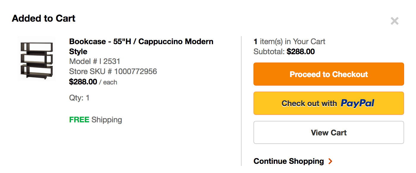
PAGE ACTIVITIES: ADD TO CART OVERLAY
Click to enlarge
DESKTOP:
"Proceed to Checkout" was most clicked
"Checkout with PayPal" is one of the lowest clicked but highest converting
Click to enlarge
MOBILE:
"Proceed to Checkout" was most clicked
"Checkout with Paypal" is one of the lowest clicked, but highest converting
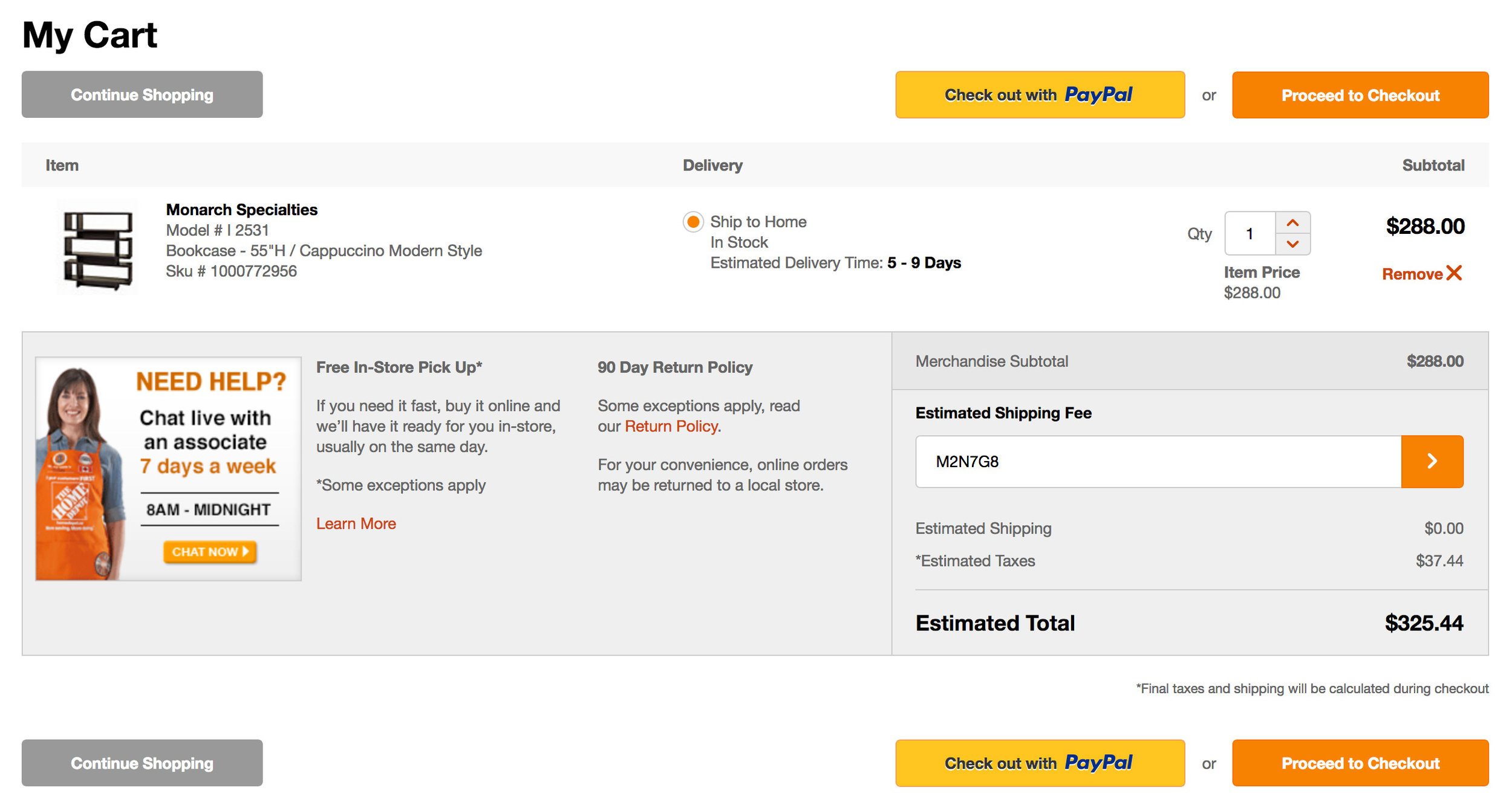
PAGE ACTIVITIES: CART
Click to enlarge
DESKTOP:
40% of the interaction was geared towards the "Remove" CTA
30% Proceed to Checkout
Only 4.5% of users used "Checkout with PayPal" but has highest conversion
Click to enlarge
MOBILE:
Highest interaction was around the "Remove" CTA
"Proceed to Checkout" has higher clicks than PayPal but PayPal has higher conversion
PAGE ACTIVITIES: HEADER
DESKTOP:
Click to enlarge
MOBILE:
Click to enlarge
COMPETITIVE ANALYSIS
Click to enlarge
Why these competitors were specifically chosen?
Save For Later functionality
Currently the cart is used as a wishlist by customers and are not confident in checking out as a result. The Save For Later functionality provides the ability to checkout with items they need while saving other items in the cart for later. This reduces cart abandonment and reminds users of saved items when they return to cart at a later time.
Order Summary (Right Rail)
I really like this idea as it provides true visibility and affirmation of the products/services the customer chose at all times. Not a lot of competitors practice this technique; however Canadiantire.ca is one of the retailer websites that does a great job in showcasing this feature, which in turn, will provide a consistent experience when it comes to checkout.
Product Recommendation
A majority of retail sites start encompassing this feature in their mini-cart rather than cart. If customers come to an empty cart, they will be shown other products that are of potential purchase, such as drills, batteries, etc. This is a great way to upsell/cross-sell other items.
Protection Plans & Warranty
This feature applies to appliances only at the moment and having it in the cart experience simplifies the existing appliance checkout flow by eliminating the extra steps and providing all the options in one place. It would be beneficial if we provide this for other forthcoming items.
Best In Class Cart Experiences
Homedepot.com: Protection Plan
Click to enlarge
Banana Republic: Save For Later, Right Rail Order Summary, Sticky Checkout for mobile
Click to enlarge
Lowes.ca: Shipping/BOPIS (Buy Online Pick Up In-Store) icons, Shipping Estimate
Click to enlarge
Reno Depot: BOPIS/Delivery Details
Click to enlarge
Wayfair: Slide In Mini Cart, similar to Amazon and Sears
Click to enlarge
Personas
I usually undertake the creation of personas to help discover the typical user(s) and their behavior when it comes to creating a website or application. However, the user base had already been defined in the discovery phase of the cart application when it first launched a few years ago. Hence, this step wasn't required. The target market is DIYers, home owners and professional contractors.
Wireframing
After taking all of the analytics and competitor analysis into consideration, I quickly whipped up a wireframe as a proposal for the revised edition of Home Depot's cart experience:

Cart Overview
1) Save For Later functionality
2) Product recommendation
3) Replicating subtotals at top and bottom (especially for mobile)
4) Ability to print/e-mail cart
5) Promo code
6) Enhancements:
- Continue shopping links to last viewed page
- Remove breadcrumbs
Display on Item Level
1) BOPIS and Shipping Icons
2) Free shipping and estimated delivery
3) Ability to change pick-up store
4) Protection Plans and Appliance Additional P&S
5) Enhancement:
- "Remove" CTA to move close to quantity selection
Prototyping
The wireframe I created was handed over to the UX/Interaction designer, Zaki Hassan, who I collaborated with to focus on the key features I mentioned above, in the interactive prototype as seen below:
Visual/User Interface Design
During the review of the prototype, the business stakeholders (UX Strategists and Product Managers) decided to go in a different direction. After some brainstorming and discussion, we came to a conclusion that it would make more sense to have each product in the cart grouped by the delivery method, with proper headings. This, in turn, would potentially increase the scannability of the cart and ease the user in making the necessary updates to each product. This is reflected in some of our design thinking and sketching seen below:
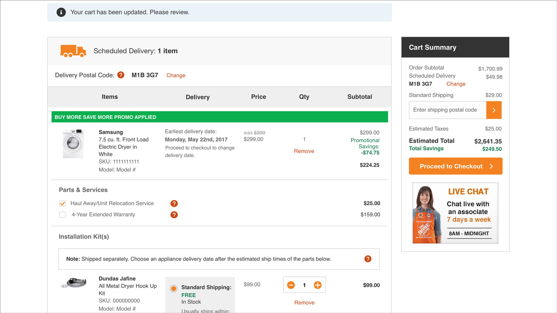
I started out designing mobile first to accomodate the majority of the user base as well as to design in a responsive manner. I decided to integrate all the potential scenarios (Scheduled Delivery and Standard Shipping), promotions as well as feedback messages all in one mock so that it would be easier for the business analysts to write stories/use cases for the development team.
As for design, I went with a clean, flat style overall, ensuring that the all typography and colors being used adhere to Home Depot Canada's style guide. Since the application is very content heavy at this point, I played around with visual hierarchy in terms of typographic treatment, color, images and icons.
The icons I designed truly helps in identifying the specific products that are being scheduled for delivery or for standard shipping. Product images and their respective names/brand names are emphasized here to ensure user affirmation as well as their respective fulfillment options. Spacing between elements was hugely taken into consideration in order to accommadate mobile tap target areas and to create visual hierarchy.
Click to enlarge
Click to enlarge
Click to enlarge
BOSS & BOPIS VISUAL/UI DESIGN
Due to the agile nature of the product release cycle at Home Depot Canada, the Product team wanted to include the functionality of BOSS (Buy Online & Ship to Store) with the release of cart. This, in fact, touches various aspects of the Home Depot's e-commerce system, such as Product Information Page, Product Filters, Checkout (which I'll talk in another case study) and Cart.
As far as Cart is concerned for this fulfillment feature, I designed the UI for the "Change Store" overlay functionality where customers have the ability to change their pick up or ship to store locations from the respective section and update them accordingly in the cart. The simple prototype I made in Principle can be seen below:
ChallengeS
ITEM LEVEL DESIGN FOR TABLET AND DESKTOP
The biggest challenge I faced was actually designing the UI for cart for the tablet and desktop, especially when it came down to the appliance product and whether a promotion had been applied. Each product had its respective description, quantity, fulfillment options, quantity increment tool and subtotal, with the appliance having a distinct Parts & Services section as well. Spacing was a huge problem especially when a promotion was applied as more content needs to be presented.
Solution:
This was all solved with the use of different typographic treatments with large typefaces for important type elements such as subtotal, product name, main fulfillment option and smaller. I used white space between elements to create distinctions between each of them to ensure proper readability.
STICKY CART SUMMARY (DESKTOP)
The sticky cart summary tends to be cut off in its initial placement, which was right beside the delivery method card, when viewed at 1024x768 (one of the common resolutions used by our customers according to analytics). The Live Chat graphic was also getting cut off halfway, leading to a bad overall experience.
Solution:
I simply shifted the sticky cart summary to align with the "Proceed to Checkout" button and migrated the Live Chat banner graphic to an actual standalone banner right below the last delivery method, resulting in a great experience.
Results
The cart has been handed off to dev and is still under development for a release in 2018. Metrics to the new design will be posted here once it has been pushed live.