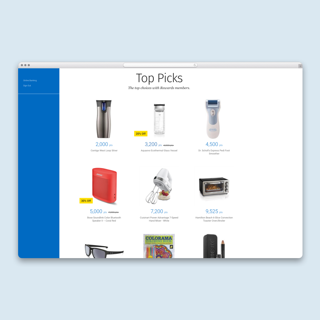
Rewards Moneris Sale Items
A redesign to showcase sale items throughout the Moneris catalogue, cart and checkout flow

URL
The Rewards Moneris Catalogue can be seen in the authenticated view of the Rewards website.
Overview
The Rewards Moneris Catalogue needed a design revamp in regards to showcasing sale items throughout the product listing page, details page, cart and checkout flow. The current state is simply illustrating the discount in red text next to the name of the product. A design opportunity came to fruition to showcase this in a more visual manner. The "sale" methodology will also have to be applied towards Gift Cards, Financial Rewards and Charity, as part of the Moneris catalogue.
My Responsibilities
I was responsible for the design research and visual/UI design in all responsive breakpoints (desktop, tablet and mobile) that illustrates the Moneris sale items. I collaborated with the Product Manager, Business Analyst, and UX Designer, to gather business requirements, while collaborating closely with the UX Designer to undergo user testing.
Design Research
I collaborated with the Product Manager and Business Analyst to gain more insight into the business reason as to why we need to showcase the sale items in a different manner in the first place.
According to analytics, the total number of product redemptions increased over the past couple of months as seen below:

Hence, a redesign as to how to best visually represent sale items in the hopes of increasing more product redemptions through points was valid.
Existing State
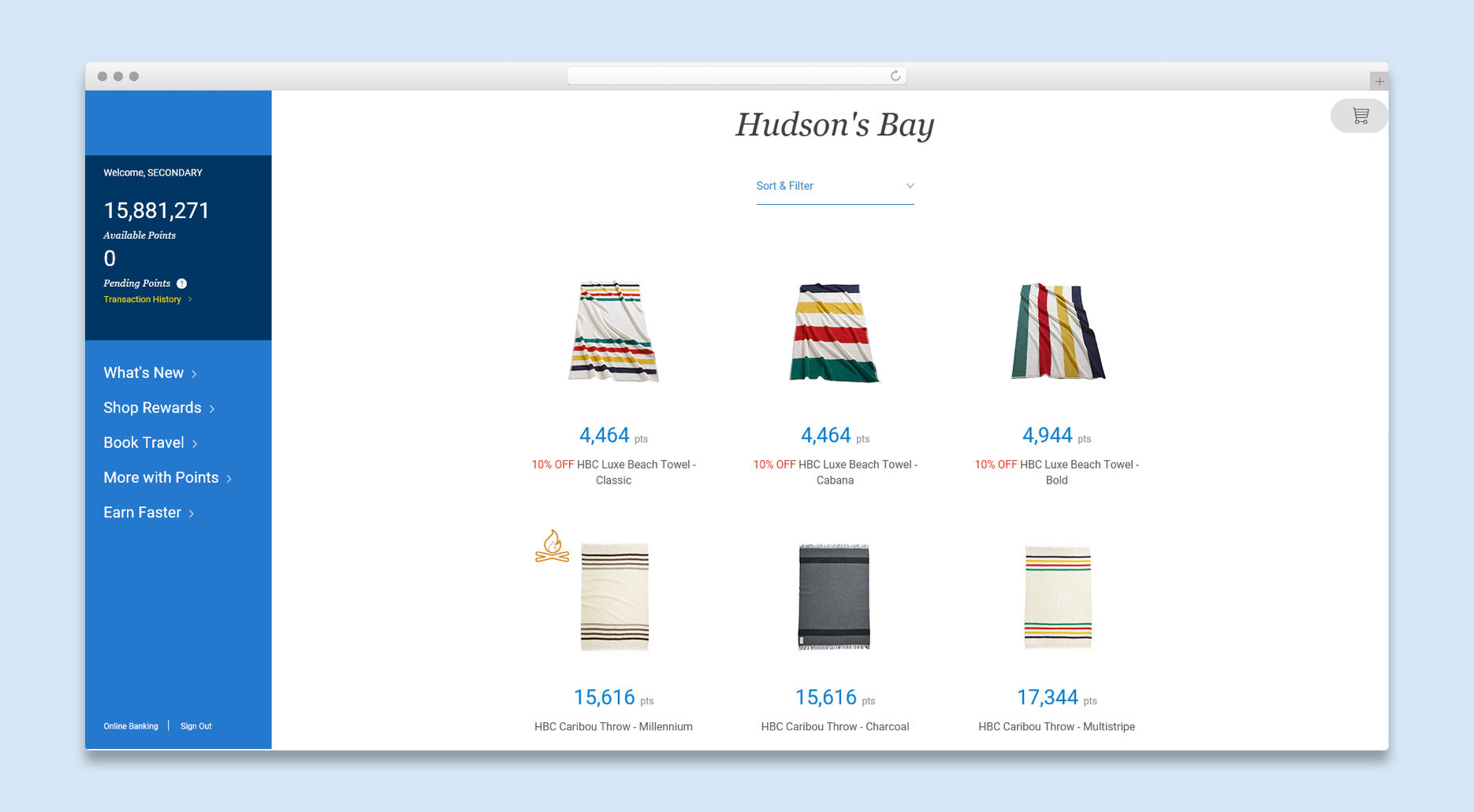
As one can see, it is very difficult for the client to actually identify the particular items on sale as it is not visually evident straight away. This is mainly due to the fact that the discount is visually represented as text along with the name of the product.
Competitor Analysis
As part of my design process to arrive at a solution, I conducted some competitor analysis as to how other online retailers showcase their sale items through the product landing/details pages, cart and checkout flow.

Overall Trends
1. Product Details/Listings Page
Different treatments of the old price being greyed out/crossed out along with the sale price in bolder colours can be seen. The amount being saved is being showcased as snipes or plain text in a different color to that of the rest of the elements. TD Rewards incorporated a stepper UI pattern to have customers quickly select the quantities needed.
2. Shopping Cart
The was/sale pricing is still shown here in the same visual treatment to that of the product details/listing page. GAP showcases the sale price with a much bolder, larger treatment.
3. Checkout
Only the final sale price is shown here to prevent the customer from being confused.
I felt that I had enough research insights in order to move forward with the wireframing and exploration stages of my process.
WIREFRAMES - PRODUCT LISTING/DETAILS PAGE
Having a “Mobile First” design approach, the Lead UX Designer and I started to quickly create a mid-high fidelity wireframe, focusing on the product listing and details page based on the insights I gathered from my user research. The design is an update to existing functionality.
I started to focus on the product listing to product details page flow at first.

1. This item is on sale or discounted. This will be shown as a percentage tag to ensure it’s easily recognizable for the customer.
2. The customer is shown the points value for this item.
3. The customer is shown the points that this item was worth if available from Moneris. A strikethrough treatment allows the customer to quickly identify the old price.
4. The customer taps the whole tile to proceed to the products details page.
WIREFRAMES - CART
After the PLP and PDP pages, we focused on the wireframing cart experience utilizing the “Mobile First” approach as well.
For consistency purposes and to avoid confusion, we used the same product layout to that of the PLP pages for each item throughout the cart flow.
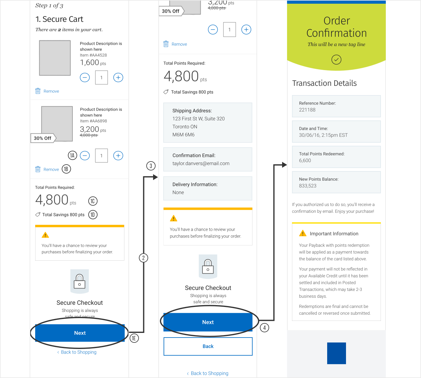
1A) I introduced a stepper for quantity input, which allows the customer to quickly enter their quantities. The “-“ and “+” buttons will be disabled and enabled when the values reached the respective min. (0) and max (99).
The customer can also select the input field and the number keypad will be presented in which the customer will be able to enter in a number value when in focus. When the focus is outside this field the keyboard will not be shown.
1B) This deletes the product from the cart.
1C) Total points required to move forward.
1D) Total points the customer will be saving.
1E) The customer taps on “Next” to move to Step 2.
2) Step 2 is being omitted here for demo purposes. In this step, the customer simply fills out the personal and shipping info required.
3) Step 3 allows the customer to review all the products, personal and shipping info.
4) The customer taps on “Next” to Step 4, which provides a summary of everything.
WIREFRAMES - GIFT CARDS
I redesigned this section to accommodate a more tappable experience, while incorporating the stepper UI pattern as well. This will allow the user to choose the specific denomination and quantity with ease. The respective denomination will be in focus as well.

Visual Design Explorations
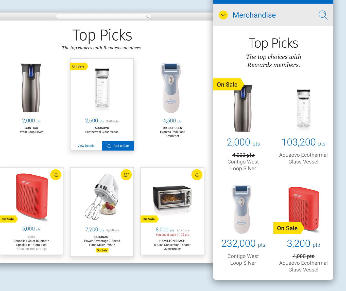
I quickly dived into some visual design explorations as to how to visually represent the SALE snipe. I played around with different placements and treatments of it as well in both desktop and mobile layouts. I felt that a yellow tag was a good representation as it adhered to the physical shopping experience.
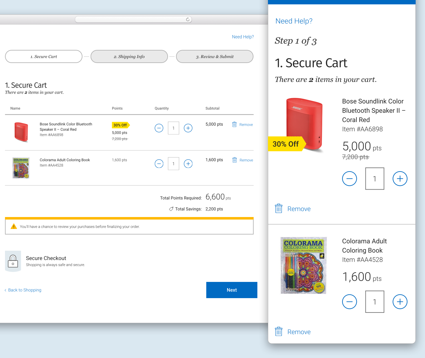
Visual Design - Cart
For the cart experience, I redesigned it to have it more of an open space, but still keeping it to a tabular structure. This enabled me to have a much larger product image, making it identifiable to the customer in return.
As for the mobile breakpoint, I used a 2 column grid to separate the product image, description and price all together, ensuring the tap targets are large enough for the quantity picker.
Visual Design - Gift Card/Charity/Financial Rewards

I visually treated the sale icon for the product image itself in a circular format as the tag format did not work well in mobile view as it was overpowering the product image. Both English and French had to be incorporated into the snipe as the Moneris platform could not support individual images for both languages.
As there are many denominations when it comes to gift cards, the Content Designer and I felt that the word “Sale” will be ideal, while still showcasing the percentage off tag at respective denominations.
For charity and financial rewards, I felt that “Sale” did not resonate well in this context, hence I collaborated with my Content Designer to come up with “Less Is More”.
ProtOtyping/User testing
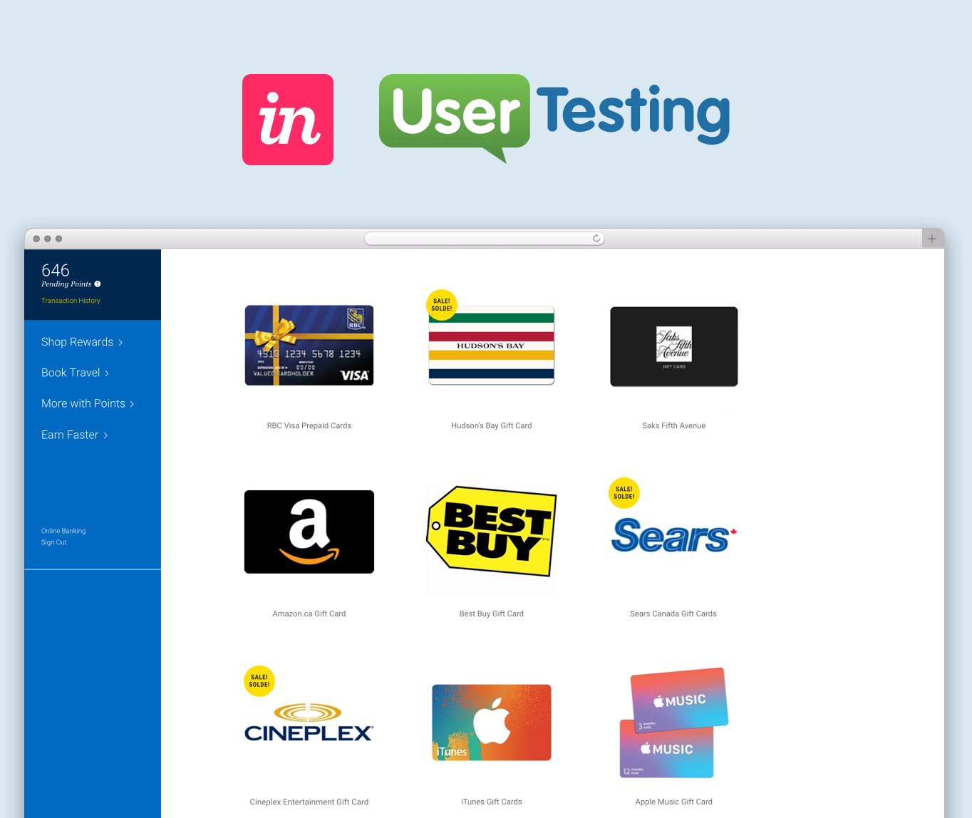
Since we were on a tight time crunch, I quickly created a clickable prototype in InVision (desktop only at that point) for user testing. I collaborated with my Lead UX Designer and Content Designer to create a user testing plan as well.
PROTOTYPE
Click here to view the clickable prototype.
USER TESTING
Target Audience
18-65, savvy online shoppers who collect rewards points as well.
Task
Redeem a HBC Gift card on sale
Insights
1) Users can instantly recognize the items on sale by the yellow tag and the was/now pricing.
2) They felt that the whole redeeming process was pretty fast and simple to use compared to other redemption sites; the progress bar helped them recognize the exact step they’re in.
3) They felt that the confirmation page provided all the required info they need to see/record. Only one user, pointed out that she felt the actual products that were redeemed should be listed again on the page.
Iterations & Challenges

ITERATIONS
Some addditional feedback that I received via other team members in terms of visual design was that the yellow sale tag, in the shape of an arrow, should be pointing at the actual product. Hence, after some explorations, I had to switch the arrow to a rectangle in the final design to solve for placement that doesn’t obscure the product image.
CHALLENGES
DEV came back to us pointing out that the old pricing cannot be shown at some Product Listing Page, Detail Page and Cart level, depending on as to what Moneris can provide in the backend.
The Lead UX Designer and I fought back denoting that this would be a terrible user experience as the user would not know the correct sale price. Having the Product Manager involved and some back and forth, we had to go with DEV’s proposal, knowing that this was only an interim; as the Moneris platform will be replaced to something new in the next year or so.
Project Outcomes
The Reward Moneris Sale Items project is currently under development and is yet to be pushed live. It will most likely go live in the near future, depending on the release schedule.
LEARNINGS
For future projects, I have learned to involve DEV right from the kick off/business requirements gathering status of the project. This way, they would have input right from the beginning and is able to raise some concerns if any.
I have learned to co-design with my colleagues, which involves different thinking methods resulting in an efficient workflow in the process.