Home Depot Checkout 2.0
A redesign of a whole new checkout experience for The Home Depot Canada.

Overview
The current Home Depot Canada's checkout experience is extremely cumbersome in nature as customers had to go through a multi-step process to checkout products, which resulted in a huge drop off rate. The redesign was an initiative led by the Product and UX Strategy teams in the E-Commerce department of The Home Depot Canada.
My Responsibilities
✔ User Research
✔ Wireframing
✔ Prototyping (co-effort with Lead UX Designer)
✔ Visual/User Interface Design
✔ User Testing
User Research
I worked in conjunction with the Online Experience Analyst as well as the Analytics Lead to gain more insights as to how customers checkout their items from either the Cart or Add to Cart (ATC) Overlay.
Brief Intro: 3 Types of Cart
Where Are We Losing Our Users?
Click to enlarge
While collaborating with the Analytics Lead, we found out that that there were huge drop off points in the current checkout flow as seen above.
User Flows of Current/Existing State
After retrieving the metrics mentioned above, with the aid of the UX Strategist, I created a few user flows that outlined the various scenarios that can occur within the current/existing state of the checkout experience of various scenarios to gain more insight.
Standard Shipping Items (Current/Existing State)
Click to enlarge
Partial Visual Flow of Current State of Checkout for Standard Shipping
Buy Online and Pick-Up In-Store (Current/Existing State)
Click to enlarge
Current Checkout State for BOPIS (Right rail points out Pick Up Store Information)
Appliance Delivery (Current/Existing State)
Click to enlarge
Partial Visual Flow of Current State of Checkout for Appliance Delivery
Competitive Analysis
The UX Strategist and I looked at an extensive list of e-commerce sites and compared them in regards to speed, ease of use and functionality. As a result, we landed on the following examples as best in-class experiences:

Indigo.ca
Indigo has its checkout experience as a one pager encompassing an accordion UI pattern. This provides an easier experience for the customer to checkout their items.

Homedepot.com
Home Depot (USA) has its checkout as a one pager as well. It is being served up for all scenarios such as standard shipping, BOPIS, appliance checkout, etc.
PERSONAS
The user base had already been defined in the discovery phase of the checkout application when it first launched a few years ago. Hence, this step wasn't required.
The target market is

DIYers

Home Owners

Professionals
Wireframing
After studying the current checkout flow, I collaborated with the UX Strategist to help create some wireframes that streamlined the flow the user undertakes to checkout their items as seen below:

Eliminate The Current Login Page
Always present Guest checkout - with ability to:
1) "Sign In"
2) "Create Account"
Modular Page
1) Only relevant modules will appear based on products in cart
2) Completion of a module will prompt the next to expand
3) User will be able to manoeuver back to completed modules
4) Completed modules will display preview of populated content
5) Completed modules will visually displayed as such
6) Accordion style - page needs to be built mobile first
Order Summary Replicated Above Cart
Submit Order Button replicated Multiple Places

Different Types of Modules
Shipping Address
1) Ability to save address to My Profile
Shipping Method
1) Articles will be listed with the ability to select shipping method (including Express in the future?)
2) Delivery schedule can be completed
3) Ability to pre-populate billing or shipping address
Payment & Billing
1) Ability to pre-populate address from shipping
2) Enter gift cards (future)
3) Credit card save/select card from wallet (future)
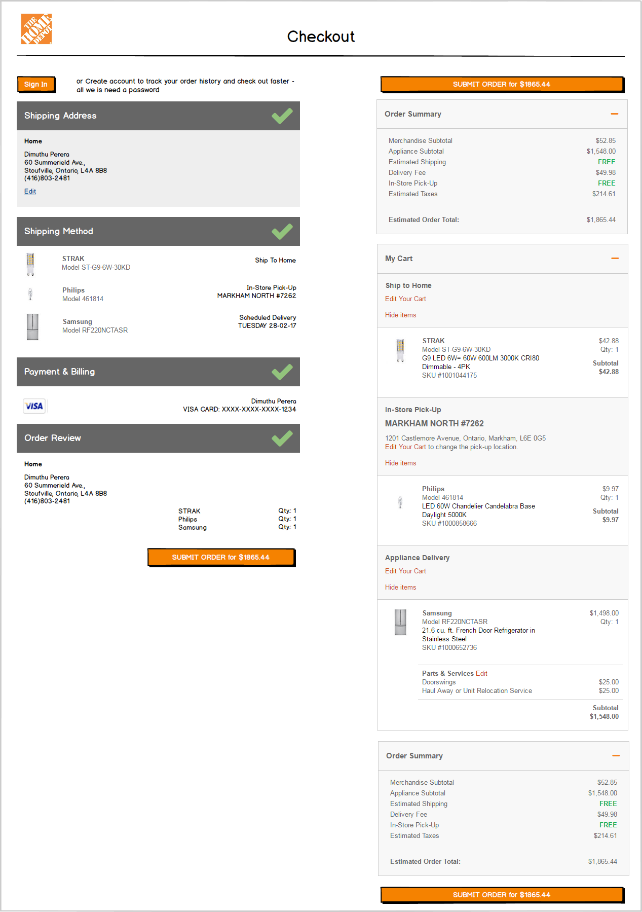
Order Review

Fully Populated Checkout Page
Each module displays a preview and an indication that it has been completed
PROTOTYPING
As part of the cross collaboration efforts between different teams when it comes to large projects, I collaborated with my Lead UX Designer, Zaki Hassan, to focus on prototyping the key features I mentioned above, in the interactive prototype below.
Usability Testing on Prototype
I strongly pushed forward to the Product Owner that the prototypes needed to be tested for usability before visual design to ensure if the one page design actually works for Home Depot customers.

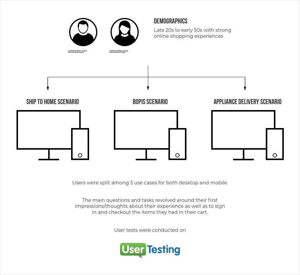
Usability testing techniques on prototype via usertesting.com
Insights
After reviewing the videos, a couple of common themes and questions came across throughout:
1) It was not clear to users that the checkout is initially a Guest Checkout; they thought that the initial form fields for E-Mail and Name are for signing in. Perhaps the Sign In and Create Account CTAs are confusing to them as they are above?
- Do we need the Name (First & Last) as we are asking these in Billing?
- Can we distinguish somehow this is a Guest Checkout?
- Can we note that the e-mail is for receipt?
2) Users are missing some information on the Confirmation page - specifically - WHEN (within 2hrs - email to be sent when ready) & WHERE (in store); it would also be helpful to:
- add store hours
- link to a return policy in a more prominent place
- add information required for pick up
Visual/UI Design
Due to a tight timeline of meeting IT's development sprint, I took all of these insights and made my way towards the visual design stage.
When it came to visual design, I went with a clean, flat style overall, ensuring that all typography and colors being used adhere to Home Depot Canada's style guide as well as WCAG 2.0/AODA guidelines. Since the application is very content heavy at this point, I played around with visual hierarchy in terms of typographic treatment, color, images and icons.
The icons I designed truly helps in identifying the specific products that are being scheduled for delivery or for standard shipping. Product images and their respective names/brand names are emphasized here to ensure user affirmation as well as their respective fulfillment options. Spacing between elements was hugely taken into consideration in order to accommodate mobile tap target areas and to create visual hierarchy.
Appliance Delivery Scenario
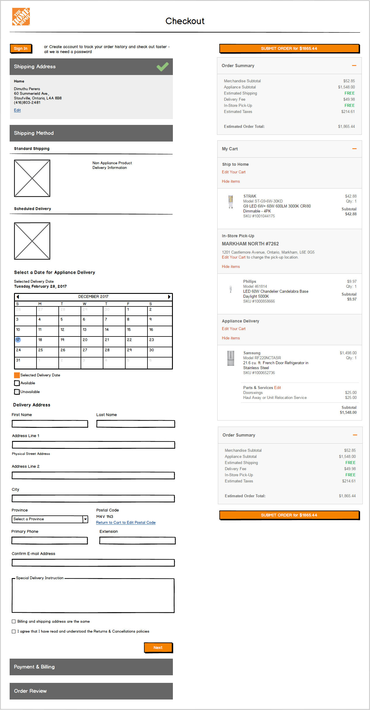
This was a complicated scenario as there were a couple of features (Scheduled Delivery Information, Delivery Date Picker, delivery dates of appliances in the cart section, Parts & Services to name a few) that needed to be showcased to the customer.
Hence I suggested that a new tile dedicated to Appliance Delivery should be created.
I utilized the same UI patterns to that of the rest of the tiles, with a balanced harmony throughout. I designed the calendar widget to ease the user in selecting a date in an efficient manner, using different treatments for current and selected dates. I used different typographical treatments to highlight the extra delivery information for each item in the cart section on the right.
The desktop viewport of this scenario can be seen below.
Click to enlarge
Edge Case Scenario
During the visual design phase, the Product Owner came to realize that an entire scenario was missed during the requirements gathering phase of the project:
A signed-in user should be able to edit his/her saved addresses in the checkout flow, instead of having going back to the "My Account" section of homedepot.ca
Due to the tight timeline and using my interaction/UX design knowledge, I quickly created responsive high fidelity mocks that outlined the flow/experience the user would take to fulfill this task.
The animated high fidelity prototype below only showcases the desktop viewport for demonstration purposes.
I came up with a streamlined, efficient task flow, with the "Save & Continue" CTA providing confirmation of the new entered address as well as progressing the user to the next step of the checkout experience.
Testing The Live Experience
Once the new checkout went live, I wanted to see how the new experience was doing in terms of usability for users as well as to see if there are any opportunities for improvement.
Insights
Some users had a difficult time progressing to the next step from the Payment Information as the fake credit card information that was provided did not go through. They were quite confused as to why the "CVV" text field did not appear.
Some users wanted to change the store they were picking the item up from or shipping to and they could not figure out a way to perform this action, even though the functionality exists on the right hand side. Unfortunately they were going back to the main site and changing the store in the global navigation.
Solution:
As a result, I saw this as a great opportunity for an iteration. I designed a separate tile in the checkout flow, using the same UI patterns as others, specifically outlining the stores the customer has chosen previously to pick the items from. Each store information can also be seen in the cart section on the right, however I've used the Progressive Disclosure pattern to allow the user to view more details of his/her choosing since having an accordion within an accordion is not a good practice. In addition, I had to take another edge case scenario into consideration in that the option for an alternate pick-up person needs to be featured as well. I merged both features into one tile to provide a seamless experience as seen below.
Click to enlarge
3. From the usability tests, I was able to able to gather some metrics in regards to the time each individual takes to checkout an item from start to finish.
Results
When the new checkout experience went live, there was a tremendous increase in conversions especially in the mobile space. French speaking customers also played a huge role as well. As I am not allowed to disclose exact numbers for confidentiality reasons, I've represented it visually to provide a general idea.
Click to enlarge
As seen in the usability tests, most users found it very easy to use and was able to checkout their items in a much shorter time frame than the previous iteration. The Desktop experience still needs to be looked at to aid in increasing conversions and usability.

